While it is generally a good idea to consider the form and function of a site first, many people want to start by choosing colors. While you may have a strong preference for a color, it is important to step back from what you like, and start to consider how the colors will impact a visitor to your site. There is a field of study called “Color Theory” where the psycho-social impact of different colors are analyzed, and it can be helpful to ensure that your concept and the colors you choose are sympathetic.
 In simple terms here are some ideas of what colors can convey. you will notice that some of the words are contradictory, and there are also cultural differences between uses:
Green: environment, nature, go ahead, envy
Red: stop, sex/lust, excitement, love, luck
Blue: trust, dignity, authority, cleanliness, sadness, sky, water, peace, serenity, masculine, corporate
Yellow: sunshine, happiness, warmth, caution, jealousy, competence
Purple: mystery, spirituality, the sub-conscious, decadence, conceit, creativity, dignity, royalty, pomposity, mourning, sophistication, power
Pink: feminine, sophistication, sincerity
Orange: vibrant, energizing, vitality, cheer, anti-intellectual, excitement, adventure, warmth, good health
Brown: ruggedness, outdoors, simplicity
Black: grief, sophistication, fear, expense
White: pure, sincere, happy
So where does this leave you when choosing a color for your site? While you can certainly go with your favorite color alone, you might also want to pick some complimentary colors.
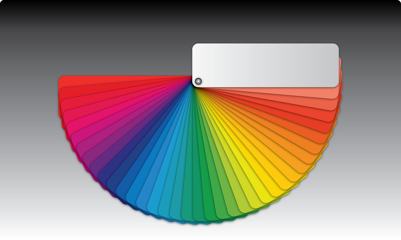
A good place to start is to look at a color wheel. The origins of the color wheel are attributed to Sir Isaac Newton in 1707. He arranged all the colors in a circle, and found that when the disc was spun, all the colors appeared to blend together to produce white.
If you start at a color you like, then sketch and equilateral triangle from that color, you will have three colors of equal weight and intensity. They are said to have the same “vibrancy”. You probably wouldn’t choose to use them in equal quantities, but a blue site with red or yellow text for headings or banner text would be balanced:
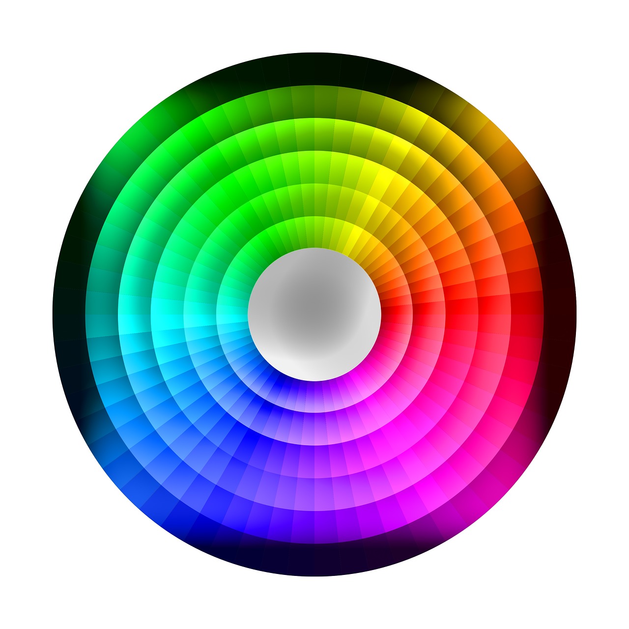
You can also take one color and pick two additional shades of that color. Then the colors are said to be “analogous”. This chart shows 6 shades of each color, so if you pick a pale orange, you might also pick a pale light orange and a dark yellow. Again, all colors would have the same vibrancy, but the color scheme would be calmer as there would be less variety of colors seen.

So now you have plenty of information to hand as you begin to consider colors for your site!