You may have noticed how many people use their smart phones and tablets to check email and browse online. This change in behavior means that websites need to adapt so they work equally well on lap-or desktop screens as well as on smaller screens.
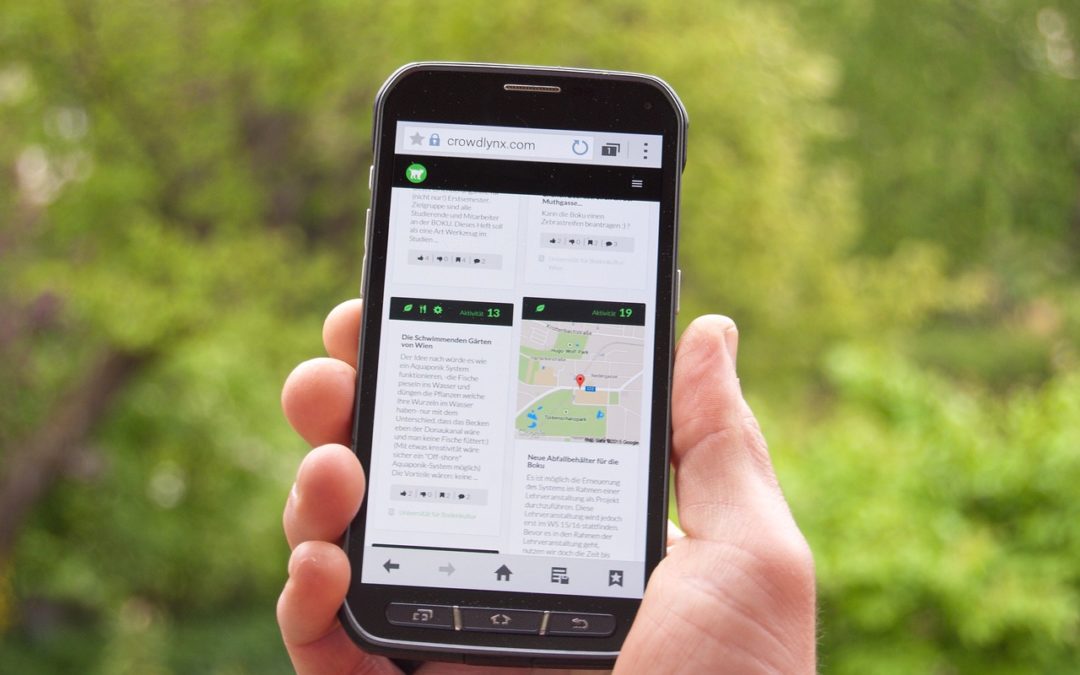
Many sites have been created with responsive web design to address this issue. Assuming you are reading this on your computer, you change your browser to the middle icon size so it no longer completely fills your screen. Now grab the bottom right hand corner and make the screen smaller. What do you notice? This site is responsive, so the content is designed to move so it is still readable on a smaller screen.
If my site had a great deal of text or complex charts, this may not be a good solution, and so I would create a mobile version of my site. The main site would then have code embedded in it to identify what equipment was being used to view it. If the code found a regular screen, then the main site would appear, but if it was a smart phone or tablet, then the redesigned smaller version of the site would be shown.
When thinking about the site you might want, talk to your web designer. For most people a responsive site will be a good solution, but sometimes you will need the second site built. This can also depend on your audience and how you think your site will be used. Is your audience going to need to type in a great deal of information? If so, a site with more space to type on a small screen might be a better option than frustrating your visitors. If you want to display your art, we can make that re-sizable and so a responsive site would be fine.
So, think about what you want on your site, who you expect to use it and how you’d like them to use it, and then ask your web designer if they offer responsive web design.