While it is easy to create designs using software like MS Publisher and Apple’s pages. However, without a knowledge of design theory it is only possible to create pieces that look ‘right’, but no way understand how to duplicate that success or transfer the concept. This is why it will cost more to hire a designer with design theory training, but you can be sure that the end result will be carefully thought out, and the design elements will be transferable for other uses.
Design Theory
What are the design theory elements you should care about?
1. Unity – this is found when all the parts of the design work well together – they ‘belong’ together.

2. Space – if the items are too crammed together it can feel ‘crowded’ and difficult to understand. Similarly, if there are only a few items and they are placed too randomly, it is hard to understand why they are all there.
3. Hierarchy – when you see a poster, or something laid out for you to read, it should be clear where you begin, move onto, and where you end. Non-designers are prone to having too many things on a page that are fighting for equal importance, so it is hard to know where to start reading.
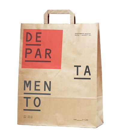
4. Typography – does the lettering add to what you see, or is it hard to read? Fonts become popular and overused, and so they become more obvious than the message they are trying to send. Fonts have evolved over centuries, so there is a benefit to knowing the history of a font to know if it is appropriate for that particular use. One bad example I pass most days is a local pizza place that uses an old German typeface for its sign. Not only is it difficult to read as I drive by, but pizza is Italian, not German in origin… When used with thought the typography can help us understand more than the words alone:

5. Balance – if too many pieces of information are on one part of what you see, it feels unbalanced. Similarly the use of a huge typeface and tiny pictures can feel very unbalanced. Most people can’t say why they don’t like what they see but if it is unbalanced, it makes it easier to put down.
6 Color – colors have a lot of emotional impact on us, so it is important to choose colors to create the impact you want, not because of another association. Again, the purpose of creating a flyer or brochure is to pass on information, and if colors are used well, they help the reader know what key points need to be digested, where to go and where to look. A few well matched colors will help make the final product easier to understand, and then ‘digest’.
7. Repetition – as humans we feel more comfortable when there is a pattern we can recognize, so gently repeating elements gives us that sense of well-being. It doesn’t have to be a huge graphic, but the same element used consistently for bullet points, and indenting them the same amount on each page makes the reader relax and feel that the person who created the document had thought it and, and so knows what they are talking about.
8. Gestalt – a term devised by the Bauhaus movement to mean the effect of the whole thing – or the whole effect is greater than the sum of the parts you can identify. This happens with forethought and planning, and again makes the viewer feel more positive towards the message you are sending them.
Beyond this, there are questions of how the information will be accessed and used. For more about this, read about usability web design.


